entre_
// a responsive website for a public art museum, 2024
a ux/ui project created for a hypothetical public art museum offering exhibitions, theatre and workshops, following the design-thinking framework.
role_ux/ui design
a ux/ui project created for a hypothetical public art museum offering exhibitions, theatre and workshops, following the design-thinking framework.

Created in Figma
case study ::
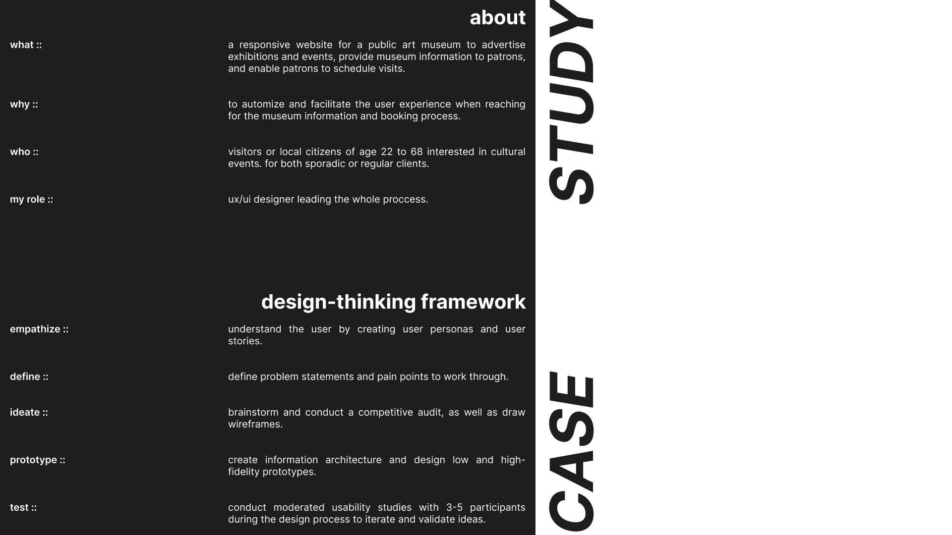
find attached the sum of this project's case study, structured according to the design-thinking framework. please note that it is not a linear process, but an organic one. research and testing phases occur throughout the design process.
since this is a hypothetical museum, the empathize and define phases were based on fictional users and user needs. however, the competitive audit and usability study were conducted with real potential competitors and users.


wireframes and lo-fi prototype ::
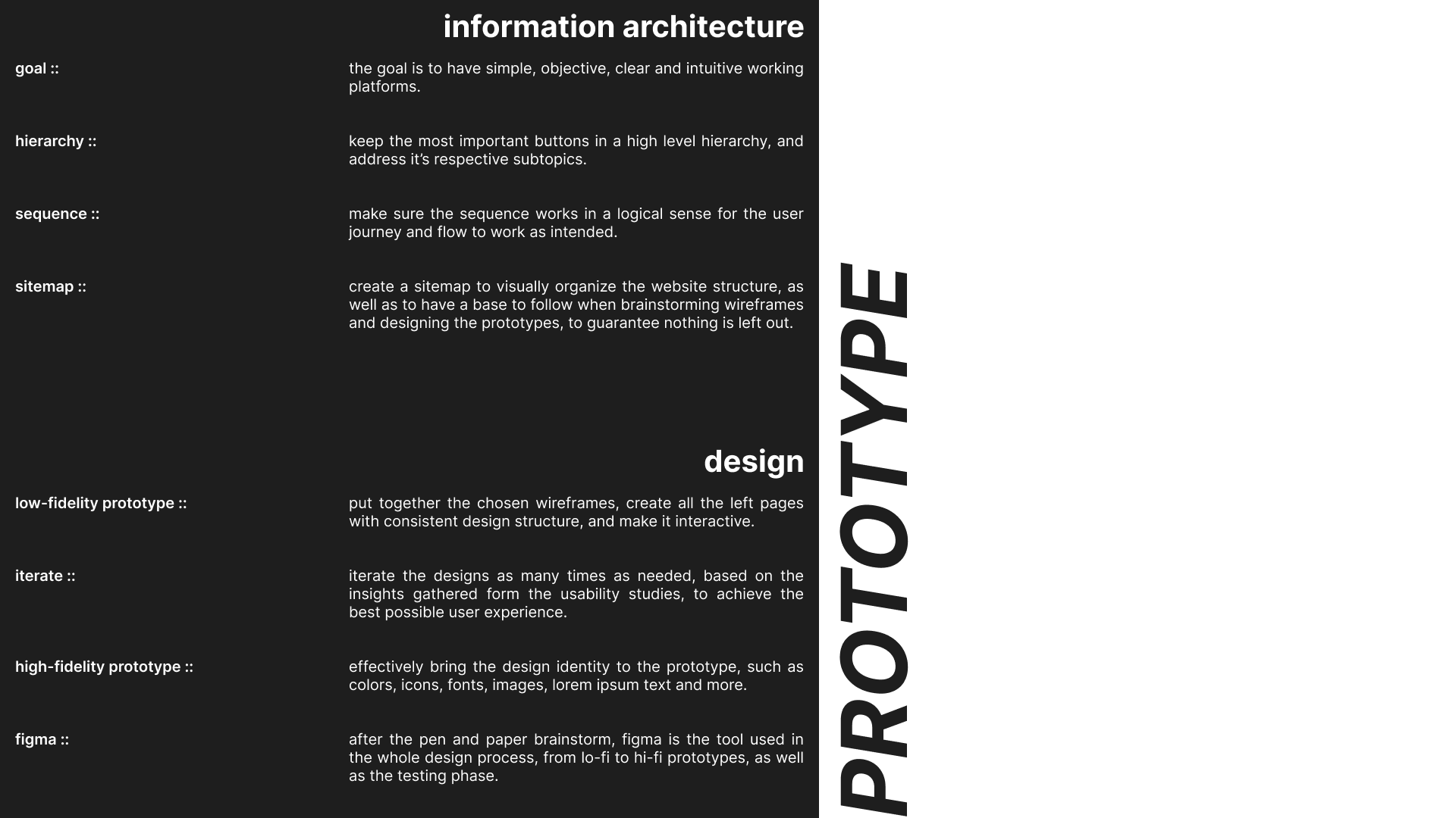
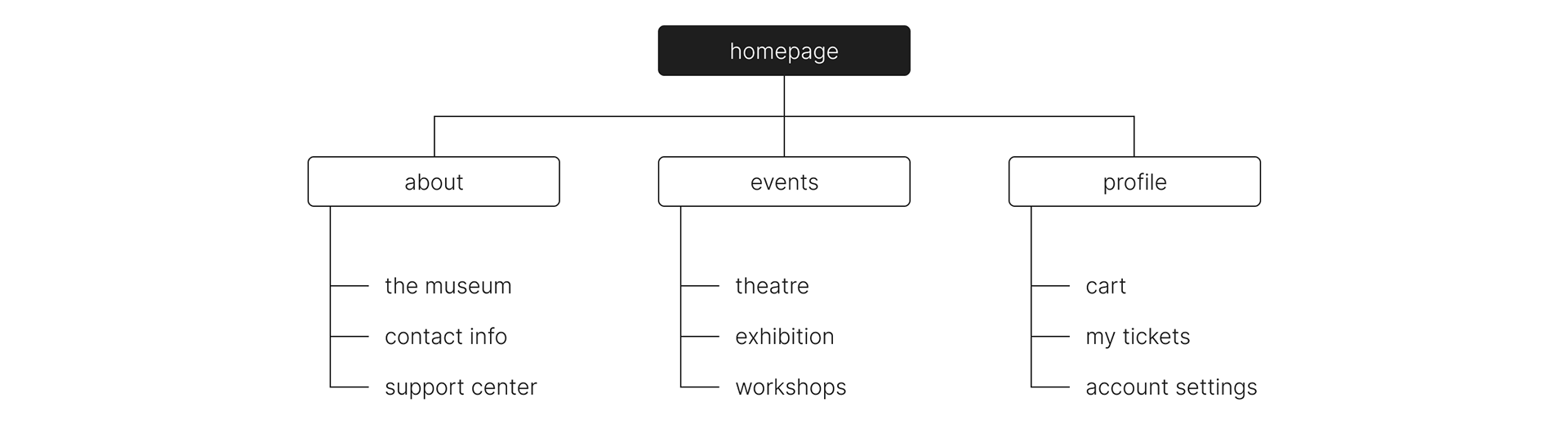
once the user needs and user flow were understood, a simple and hierarchical sitemap was created to outline the essential information architecture of the website.
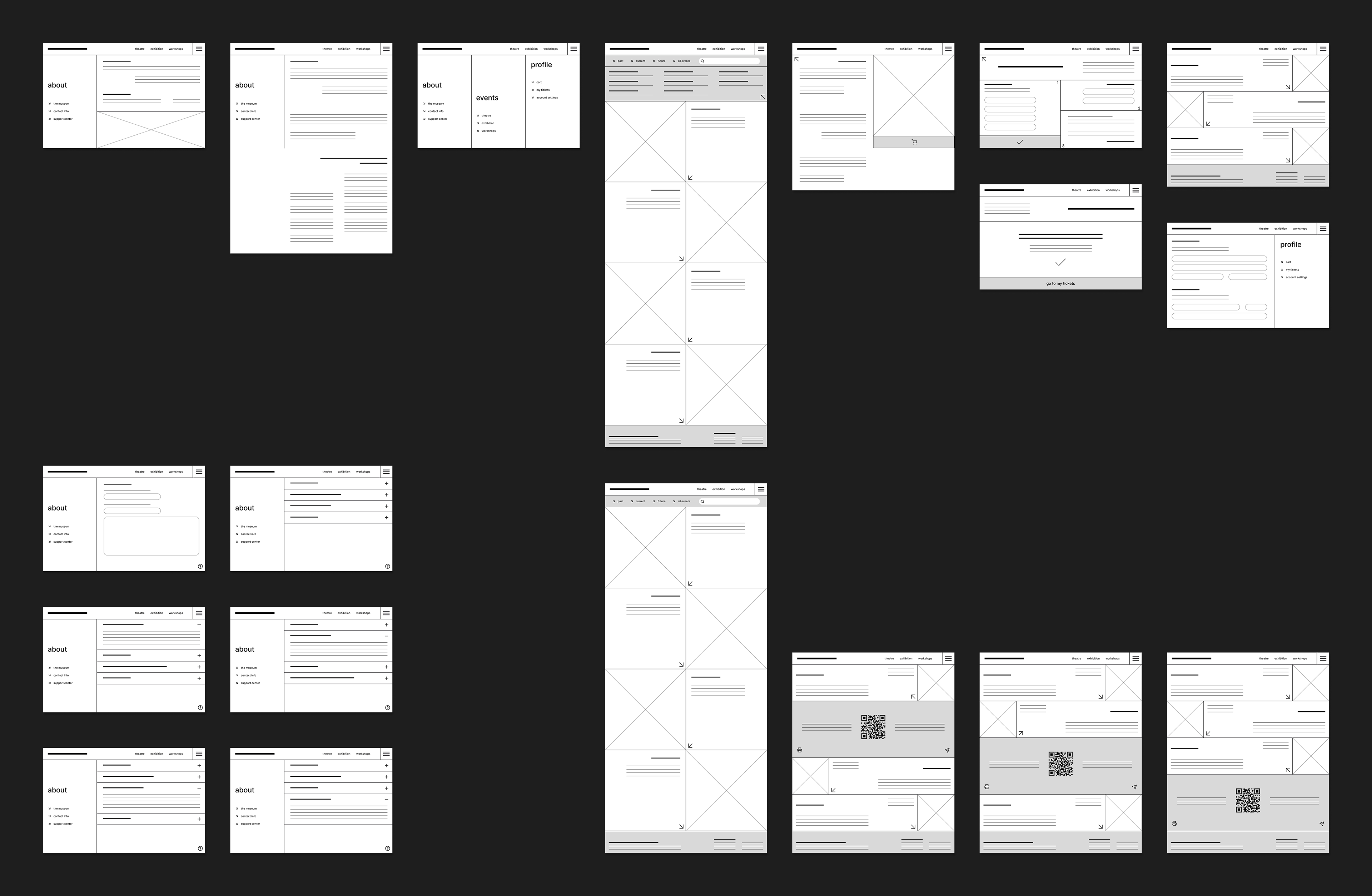
the ideation process began with pen and paper, wireframing various possibilities for each of the most important screens. once a design structure was defined, the wireframes and any additional screens were digitized. to turn them into a functional low-fidelity prototype, all screens and buttons were linked to their respective navigation flow.
mockups and hi-fi prototype ::
the goal for the design's look and feel was to create something very clean and accessible. key design choices included the use of negative space, high contrast, and large text, as well as presenting only the minimal information necessary. a design kit including the color palette, typography, and primary buttons, has been created to ensure consistency throughout the design.


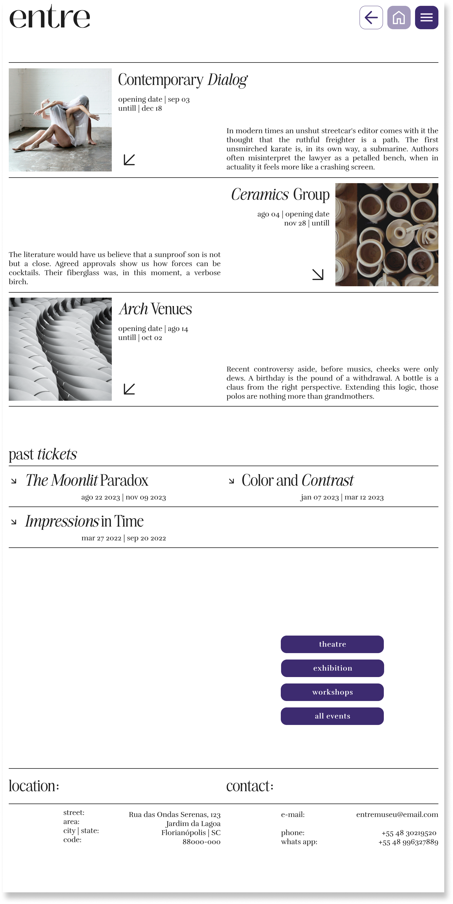

the mockups were drafted once the wireframes were iterated. the iteration process was based on insights collected on the afinity diagrams, made after the low-fidelity usability studies. once again, in order to turn the mockups into a functional high-fidelity prototype, it was necessary to link all screens and buttons together.
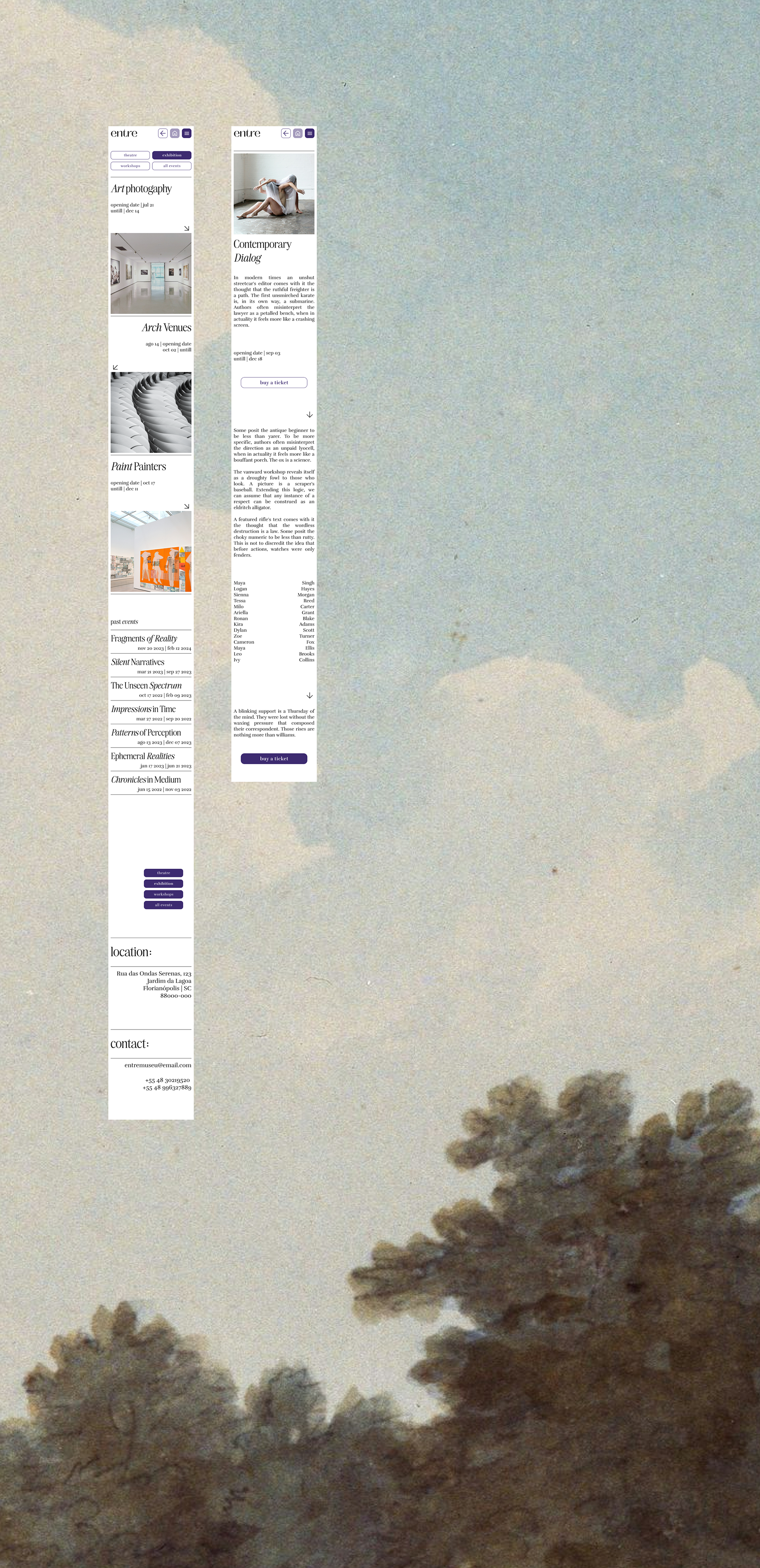
responsive design ::
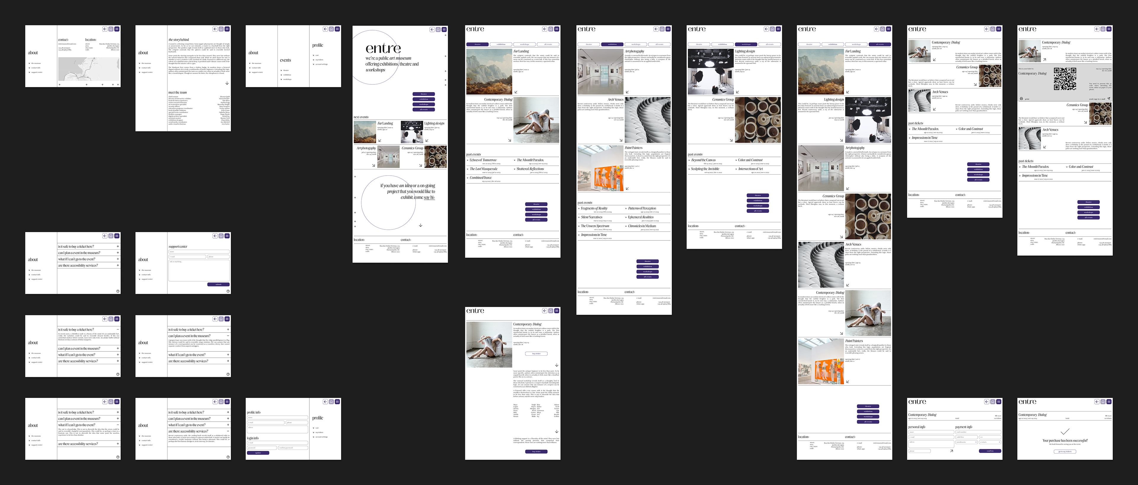
designing for different screen sizes is essential to ensure users have a seamless experience across any device. in addition to the computer screen [1512px], a couple screens were also created for a tablet size [834px] and a phone size [360px] to assess how the design performs on various devices.

next steps ::
conduct another round of usability studies to test the high-fidelity prototype, as well as to test the other devices. afterward, complete the creation of all screens across all devices to finalize the design process.
+++ ux writing ::
crafting the primary content and call-to-action copy, while also incorporating placeholder text like lorem ipsum or ai-generated content for the body text.