eartlhy_
// a meditation app, 2024
designing mockups for an app under a two day challenge, condensing key design phases to explore what could be accomplished within the timeframe.
role_ux/ui and visual design
designing mockups for an app under a two day challenge, condensing key design phases to explore what could be accomplished within the timeframe.

Created in Figma
process ::
starting from the idea and conceptualization phases, a brief competitive audit was conducted among similar apps. after understanding the basic site structure, the mockups were designed to better align with its information architecture and set the visual atmosphere.
concept ::
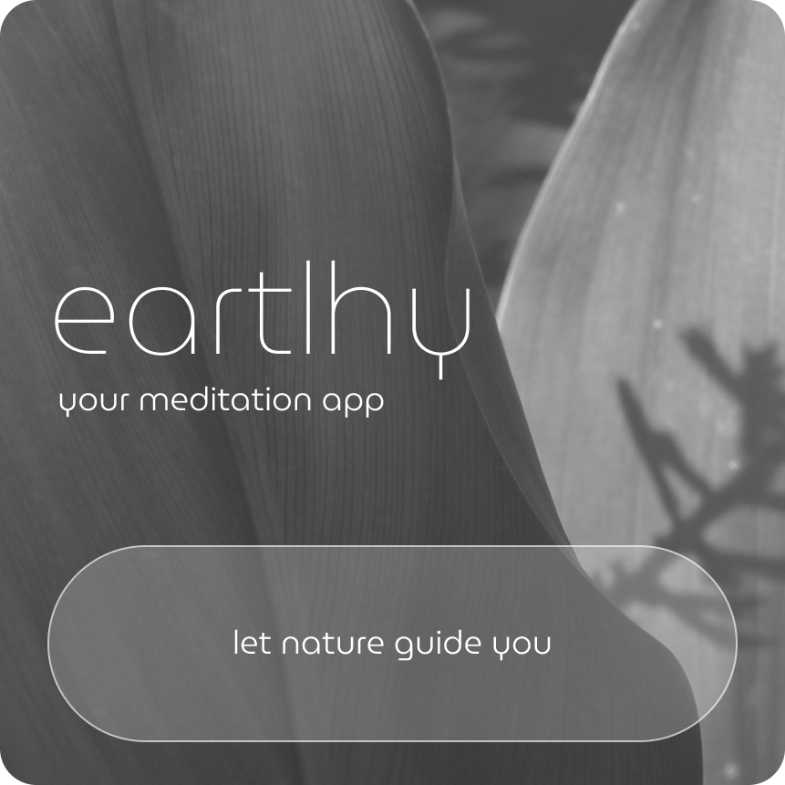
the idea for a meditation app emerged from connecting a personal interest with old nature photographs. this inspiration led to the creation of a wellness and nature-themed app, born with a immediate and organic call-to-action copy: "let nature guide you".

research and define ::
conducting a brief competitive audit of similar meditation and music streaming apps was essential to understanding what features to include. this allowed for the subsequent development of a clear and simple information architecture.
mocukps ::
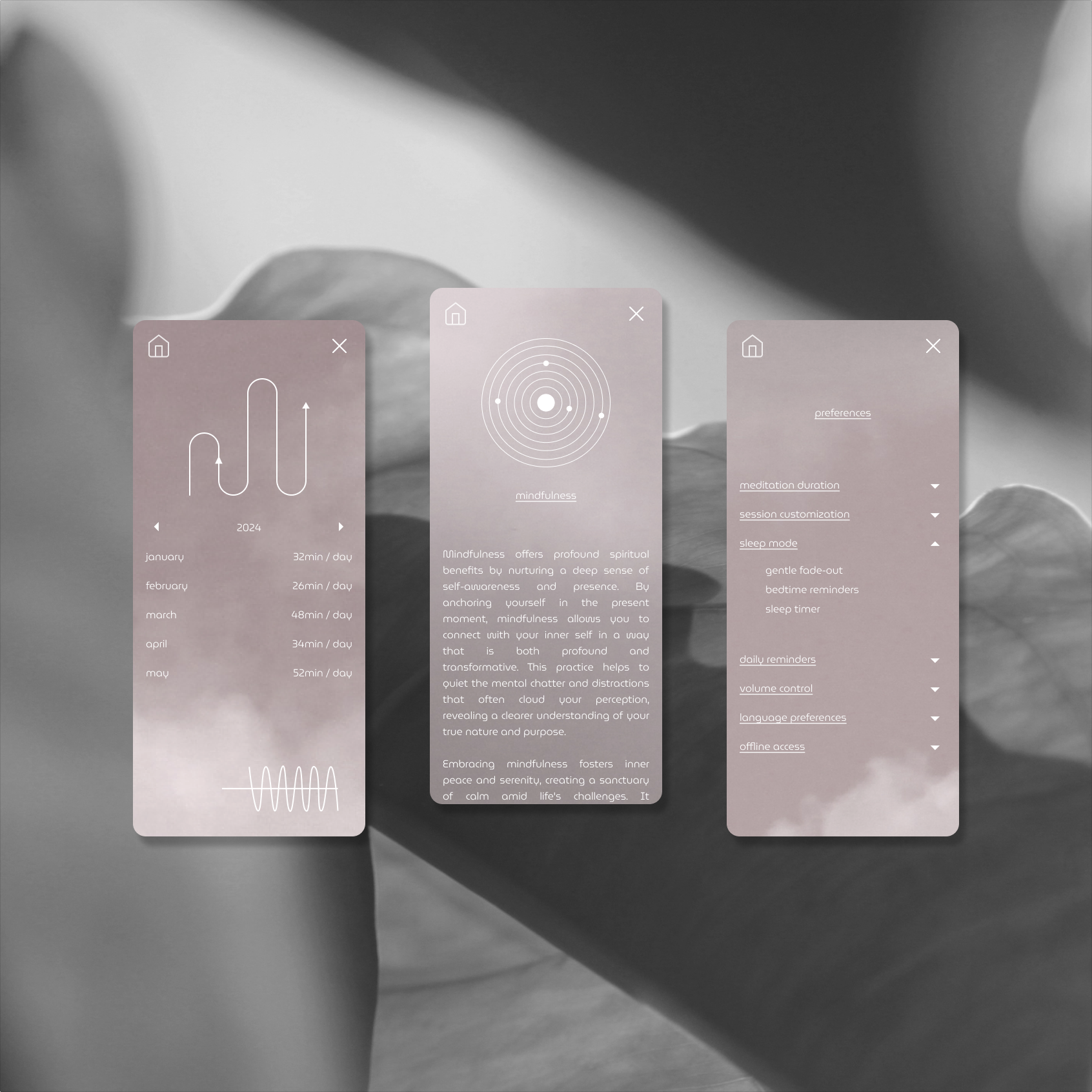
focusing on the app's primary function — a immersive meditation streaming — all main screens were designed to establish its intended visual and sensory atmosphere, as well as the overall content structure.
the color palette and background images were thoughtfully chosen to enhance the experience of relaxing through meditation.


moon cycle ::
as an additional feature, a lunar calendar was included, along with moon phases and their descriptions, to enhance the app's content and provide users with more contextual information.
personal indicators ::
as found in some meditation apps, a personal indicators space was designed to help users track their measures and progress. additionally, a preference settings section was included to give users control over how the app meets their individual needs.
next steps ::
create the remaining screens and make the app interactive to enable a proper and thorough usability study with potential users, testing how well it meets their needs. furthermore, give careful consideration to accessibility to ensure an inclusive user experience.
learnings ::
while designing with a textured background added visual interest, it created challenges for accessibility, as it lacked a consistent color to ensure proper contrast. in future projects, if a textured background is used again, it will require extra time and careful attention to establish clear accessibility standards. this will help ensure readability and equity for all users.
+++ ux writing ::
crafting the primary content and call-to-action copy, while also incorporating placeholder text like lorem ipsum or ai-generated content for the body text.